Changes in Apple Health Export
A post that goes into some detail on how to import the Apple Health Export and correct the time stamps.
[Updated September 4, 2021]
This is a follow-up to an earlier post exploring the Apple Health Export. The earlier post describes how to export the Health data from the iPhone and import it into R.
This post will look at issues of the stability of how some summary measures are defined and look for other changes in the export.
At the end of the post I have included some of the R code used to create this post to illustrate some tips on using ggplot2 offered by Cédric Scherer
Resting Heart Rate
According to Wikipedia:
resting heart rate … is defined as the heart rate when a person is awake, in a neutrally temperate environment, and has not been subject to any recent exertion or stimulation, such as stress or surprise.
But note the passive voice. In practice I have not found clarity about the conceptual definition of resting heart rate. One must be aware of the operational definition, that is, how is the measurement actually made. Let’s start with the national norms compiled by the CDC. They conduct an annual survey called NHANES (National Health and Nutrition Examination Survey). NHANES includes information on pulse rate as part of their measurement of blood pressure. The protocol for collecting data for NHANES is specified in exhaustive detail in their physician procedures manual. For individuals eight years or older, pulse is taken as part of the procedure for measuring blood pressure. First there are elaborate instructions on how to measure for the size of blood pressure cuff needed and how to place the cuff. The next step is the measurement of pulse:
The pulse is taken after the SP [subject person] has been seated and resting quietly for at least 3 minutes. Position the arm with the right palm upward. Palpate the radial pulse on the lateral flexor surface of the wrist with the pads of the index and middle figure. The pulse is counted for 30 seconds and the number of beats in a 30-second period is entered in the heart rate field.
So the national norms for heart rate are based on putting on a blood pressure cuff, sitting quietly for at least 3 minutes, and then a physician takes your pulse. That procedure leads to articles such as Relation of Higher Resting Heart Rate to Risk of Cardiovascular Versus Noncardiovascular Death which used NHANES data to examine the association of higher resting heart rate with mortality. In other words, the procedure is the operational definition of “resting heart rate” in studies based on NHANES.
New devices such as Fitbit or Apple Watch make the measurement procedure used by NHANES seem like the horse and buggy days. With wearable devices, there may be hundreds of heart rate readings during the day. Which one is interpreted as being the resting heart rate? The key issues is how one interprets “resting.”
How does the Apple Watch measure resting heart rate?
Here’s what the Apple developer documentation says about resting heart rate:
Resting heart rate is commonly correlated with overall cardiovascular health. It is an estimation of the user’s lowest heart rate during periods of rest, and is intended to be used as a medically relevant metric. A resting heart rate sample is different than a sedentary heart rate sample (that is, a sample using the heartRate identifier with a HKHeartRateMotionContext.sedentary motion context). For example, if the user finishes a high-intensity workout, and then sits down to rest, the next heart rate sample may be marked as a sedentary sample, but it is still much higher than the user’s actual resting heart rate. To produce more accurate results, the system estimates the resting heart rate by analyzing sedentary heart rate samples throughout the day.
Because the resting heart rate estimates become more accurate as the day progresses, the system may delete earlier samples and replace them with better estimates. Apple Watch replaces only the samples written by the watch for the current or previous day.
That text is fairly long and seems very concrete, but it is not so clear what it means in practice. I will dive deep into my own data to try to observe what is actually happening with the measurement of resting heart rate.
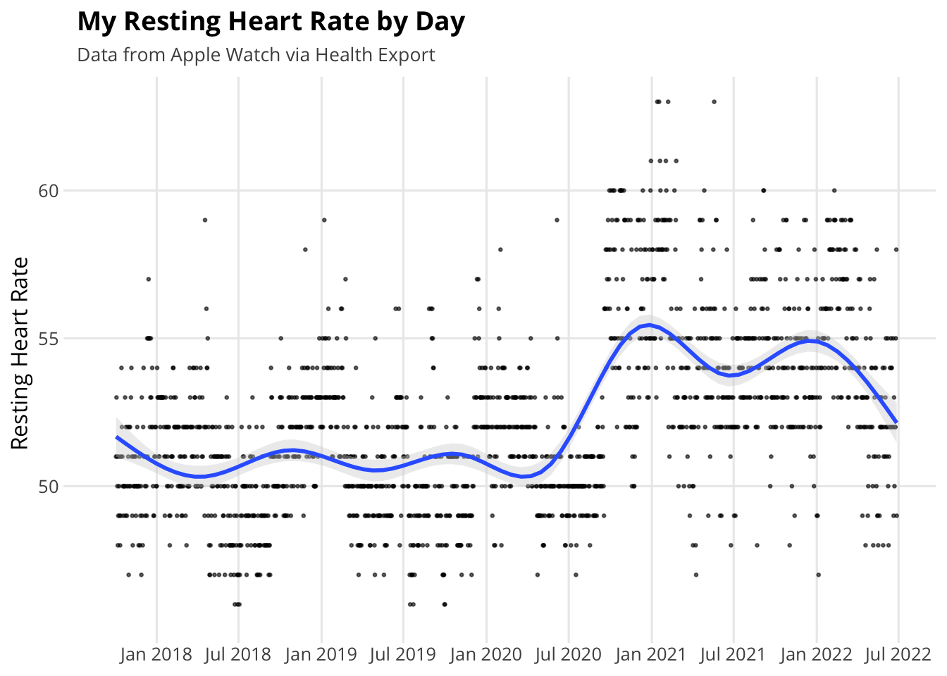
This figure shows my daily resting heart rate back to 2017. I have added a smoothed curve to show the trend during this time period. Note that resting heart rate seems to be higher in winter and lower in summer. That’s interesting and not something I noticed until I did this graph.
You can also see that my heart rate is noticeably higher starting around December of 2020. Should I interpret that as being medically significant? Has my health changed? Has my fitness level changed?
We’ll see that the change is in how Apple constructs “resting heart rate” rather than in me.
The next figure adds vertical green lines to show when I upgraded the Watch OS software.
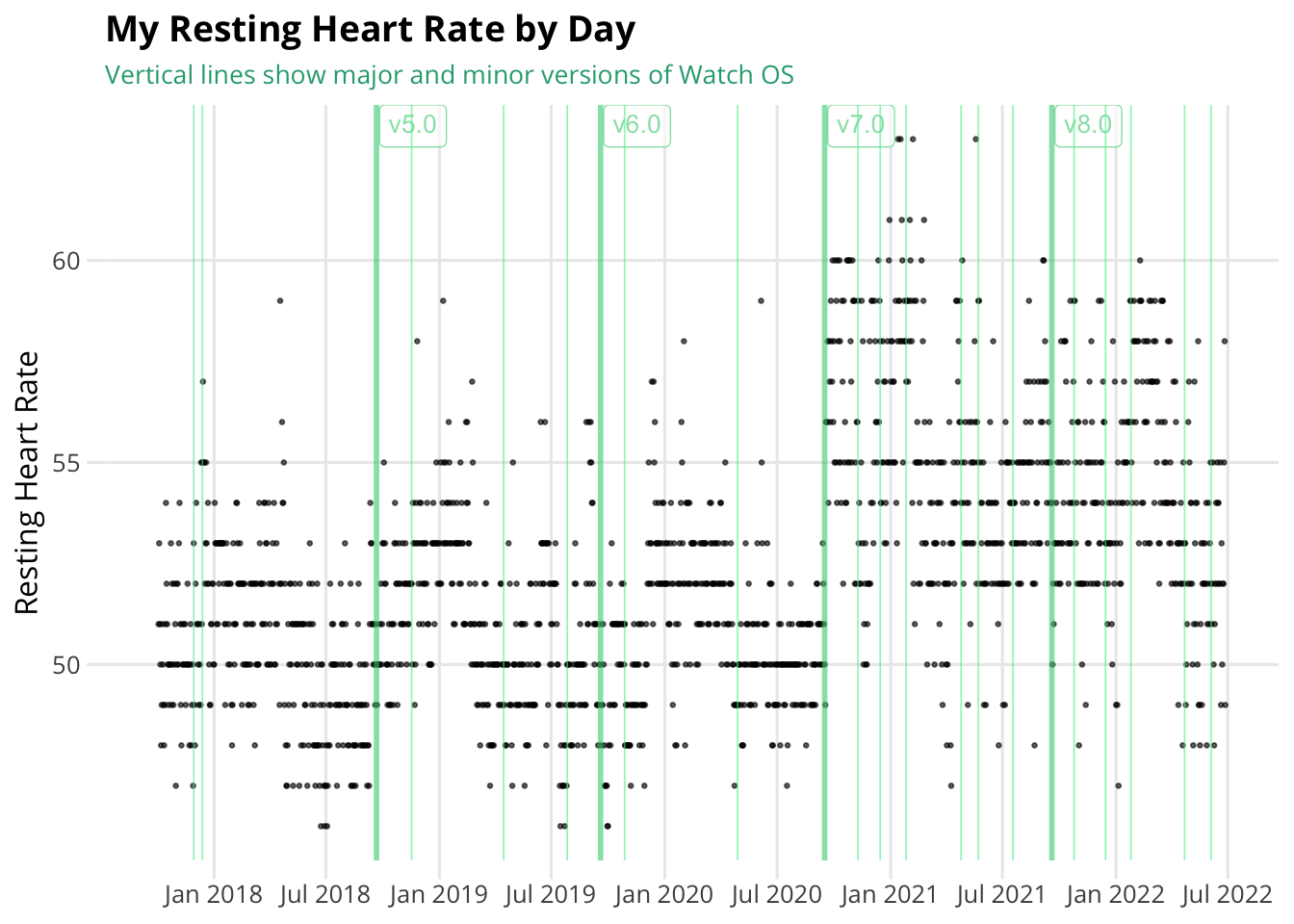
It’s clear that resting heart rate was suddenly higher after I upgraded to Version 7 of WatchOS. I did some searching, but the release notes for Version 7 don’t mention this. I did come across a brief article by Harry Guinness in which he picked up on this change. He noted that Version 7 also introduced Apple sleep tracking. What appears to be going on is that before Version 7, resting heart rate was close to the lowest heart rate while one is asleep (if, like me, you wear the watch at night). He also pointed out that when you go to the Resting Heart Rate section of the Health app, at the bottom of the screen there is an “about Resting Heart Rate” note that partly explains what they are doing:
Your resting heart rate is the average heart beats per minute measured when you’ve been inactive or relaxed for several minutes…. Resting heart rate does not include your heart rate while you’re asleep.
The key qualifier is “not while you’re asleep” combined with the fact that Apple didn’t start tracking sleep until Version 7. Before Version 7 the calculation of resting heart rate couldn’t take note of whether or not you were asleep, only whether you were inactive.
So Apple isn’t hiding what they are doing, but they didn’t do anything to help users interpret changes in their resting heart rate. On the Apple discussion board, there’s a thread in which users try to puzzle out what is happening to their resting heart rate.
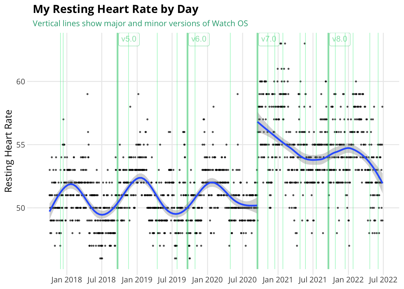
Here’s yet another graph of my resting heart rate, but in this one I show a separate smoothed trend line for the periods before and after I upgraded to Version 7.
Just to beat this issue to death, I did a bit more digging into the details of the Apple Health Export. For each data row of the export there is a start date and an end date (where date in R terms is a datetime value with both date and time). For resting heart rate, the start date is usually just after midnight at the start of the new day. The end date varies quite a bit and changes with Version 7. The next graph shows the time of day for those end dates. You can see that after Version 7, the time of day for the end date generally occurs before my normal bedtime, i.e., while I’m still awake.
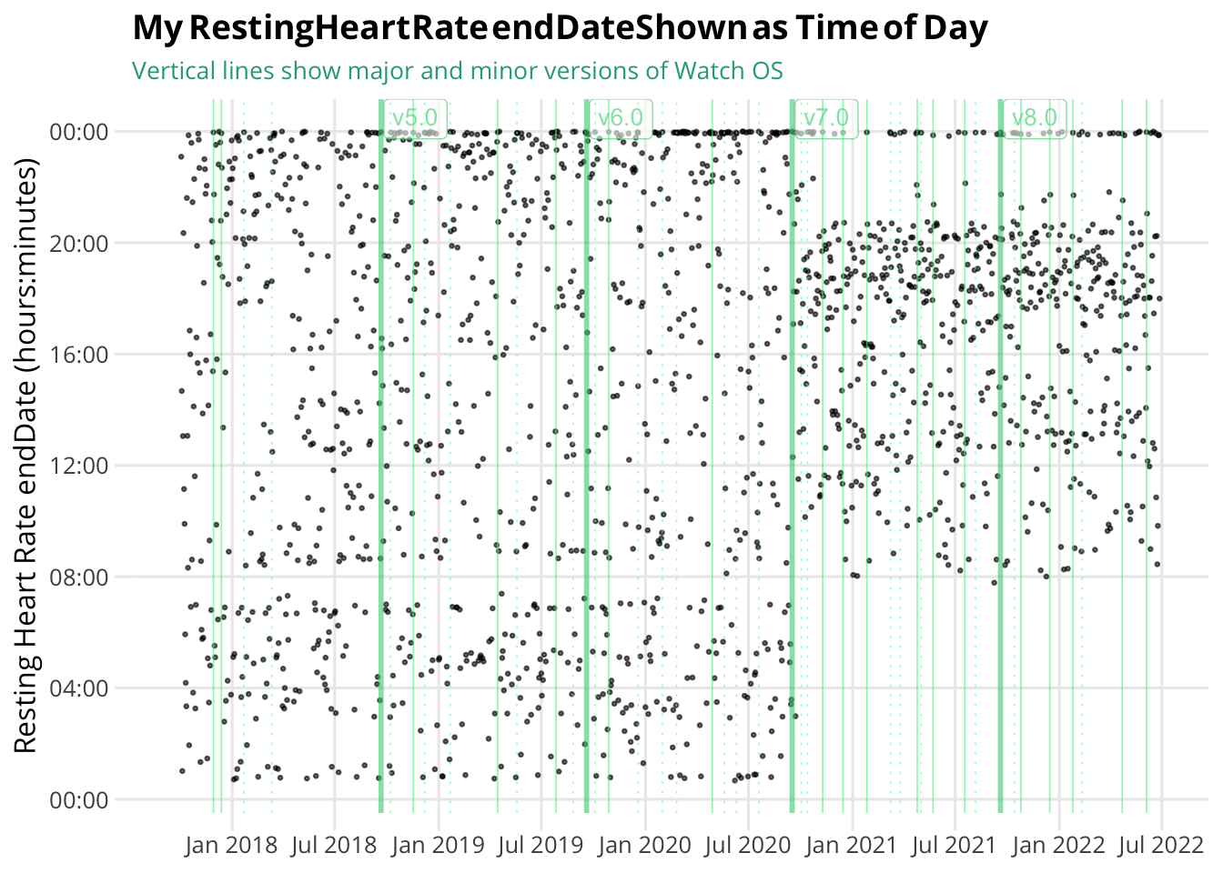
No doubt Apple will improve how it identifies when one is asleep. That may directly affect the measurement of resting heart rate. In general terms, for the Apple Watch and for other wearables such as Fitbit, to interpret resting heart rate you need to know whether “resting” includes sleep time.
VO2 Max
VO2 Max is the rate of oxygen consumption during heavy exercise. Direct measures of VO2 Max involve exercising while wearing a face mask that measures oxygen and carbon dioxide concentration of the inhaled and exhaled air. Obviously that’s not something your Apple Watch can do. Instead, Apple estimates VO2 Max. The Wikipedia article on VO2 Max describes a number of different methods for estimating VO2 Max. What does Apple do? Who knows. That’s the kind of thing that Apple keeps close to the vest.
Here is the description of VO2 Max provided by the Apple Developer Documentation:
Understand Estimated Test Results
Apple Watch Series 3 and later estimates the user’s VO2max by measuring the user’s heart rate response to exercise. The system can generate VO2max samples after an outdoor walk, outdoor run, or hiking workout. During the outdoor activity, the user must cover relatively flat ground (a grade of less than 5% incline or decline) with adequate GPS, heart rate signal quality, and sufficient exertion. The user must maintain a heart rate approximately greater than or equal to 130% of their resting heart rate. The system can estimate VO2max ranges from 14-60 ml/kg/min
The user must wear their Apple Watch for at least one day before the system can generate the first vo2Max sample. Additionally, the system doesn’t generate a vo2Max sample on the user’s first workout. However, it can make estimates based on data collected outside a workout session.
Apple Watch estimates VO2max based on sub-maximal predictions rather than peakVO2. Users don’t need to achieve peak heart rate to receive an estimate; however, the system dose need to estimate their peak heart rate. Users who take medications that may reduce their peak heart rate can toggle a medication switch in the Health app to enable more accurate VO2max estimates.
As with resting heart rate, let’s look at my values for VO2 Max to see what it reveals.
Warning: Expected 3 pieces. Additional pieces discarded in 1 rows [8].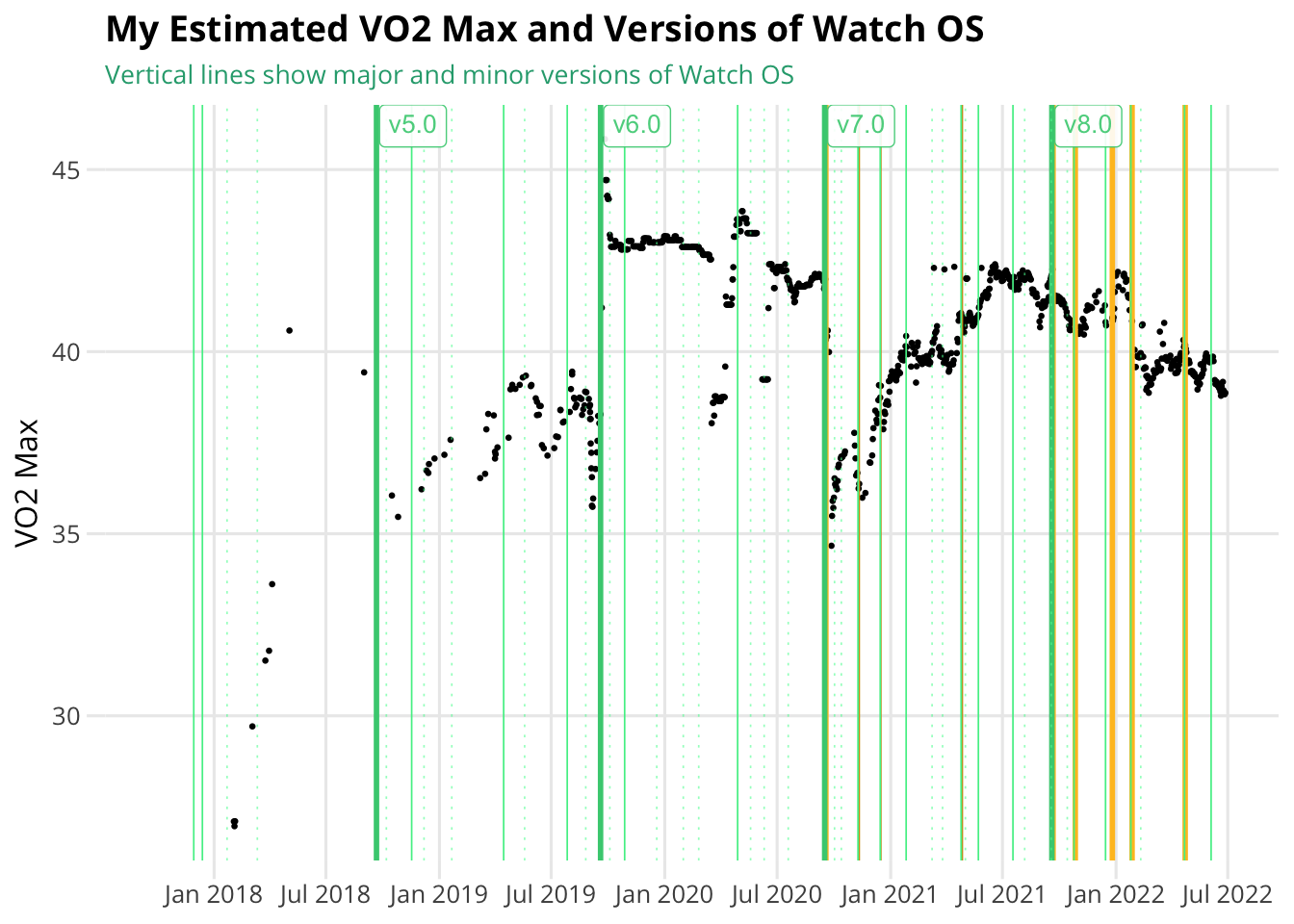
What can I make of these changes over time? It’s evident that the estimated value of VO2 Max is dominated by the details of how estimation is done during each version of Watch OS. There are dramatic changes in this chart that have little (or nothing) to do with my fitness.
What about the trend within each version of Watch OS? For example, during Version 7 my VO2 Max has been on a steady upward march. No, I can’t relate that to the personal experience of my fitness. I do a challenging three-mile walk in the woods almost every day with an occasional longer walk thrown in from time to time. It’s hard to imagine what estimation procedure would produce these trends. In Version 7 of Watch OS perhaps the procedure starts with an estimate based only on height, weight, age, and gender and then modifies it based on observation of workouts. Looking at the period during Version 6, there was a big drop on March 17, 2020 and then a big increase on April 9. When I look at the details of the workouts during that time period I don’t see anything that would relate to a change in estimated VO2 Max. My conclusion is that I should not attribute short-run changes in the estimated VO2 Max to actual changes in my cardio fitness.
The press release for Watch OS 7 introduced “low range VO2 Max”
Apple Watch already estimates average and higher levels of VO2 max during vigorous outdoor walks, runs, or hikes, which many runners and other athletes monitor to improve performance. Now, with watchOS 7, Apple Watch uses multiple sensors, including the optical heart sensor, GPS, and the accelerometer, to estimate lower levels, too.
I don’t know whether the low range VO2 Max had any effect on me. It’s likely that my normal daily walk was sufficient to estimate VO2 Max so they low range estimation procedure was never needed.
Including an estimate of VO2 Max is an interesting concept, but so far it seem that both the short run variations the long-term trend are affected by changes in the estimation procedure. VO2 Max won’t be useful until Apple settles on a stable methodology. I look forward to seeing that someday.
An overall theme of this post is that one should expect there will be additional future changes in the Apple Health Kit as Apple works to improve their health and fitness information. Of course we as customers want it to improve. That means that when interpreting long term trends in the data one has to allow for the possibility that the definition of measures have changed.
What Happened to My Million Rows of Data?
When I did my first post on the Apple Health Export, I had a total of 4,012,907 rows of data. My most recent export has only 3,026,367 so about a million rows smaller even though I have added a whole additional year of data. What gives?
Fortunately I had an archive of the dataset that I used from a year earlier. I did a full_join of the two datasets by start time, end time, and type. It was very easy to spot the source of the change. At some point during the last year Apple changed how the export handles workouts. Data outside of workouts is unchanged. For workouts older than 90 days, the export now summarizes the items that are frequently measured: Active Energy Burned, Basal Energy Burned, Heart Rate, and Distance Walking or Running. The two energy items and distance are each summed over a five minute period. Heart rate is the average over a ten minute period.
Normally heart rate is reported as a whole number, but in the summarized workout data it is now displayed to one decimal point.
On a typical 65-minute outdoor walk done within the last three months the export has 1,515 Active Energy and Basal Energy measures, 658 Heart Rate readings, and 1,493 Distance Walking Running measures. For the same walk done more than three months ago, there are only 15 Active and Basal Energy measures, 7 Heart Rate, and 13 Distance. There are about one-tenth as many measures in the older workouts and each value is a summary for a period of time. Workouts generate a very large number of measurements so summarizing those measurements can make a big difference in the size of the exported dataset.
Does this matter? Summarizing some of the workout detail seems reasonable. Although one might imagine a hypothetical case where the detail in the older workouts would be needed, it doesn’t seem like a practical problem. I write crazy blog posts like this so in my case I may try to archive a copy of the data every 90 days, just in case.
I wondered whether the details were removed from the Health Kit data on my phone or only in the Health Export. When I use the Fitness app to look at old workouts I can still see all of the detail of the heart rate measurements. It’s clear that a summary of workout data is created for the Health Export, but the actual data remains on the iPhone. So all of the detail is still there, it’s just not included in the export. Using the premium version of the Heart Analyzer app (which is only $1.99), one can clearly see that the original heart rate data is available even for older months that are summarized in the Health Export.
How Do We Know What the Health Measures Actually Measure?
Apple wants the Watch to be taken seriously as a medical device. To take the Health items seriously, one needs to have confidence in them. Greater transparency would help to support trust. Apple may not be willing to describe the operational definition of the summary measurements they provide. That makes it harder to determine what is actually being measured. Here we have looked at resting heart rate and VO2max and alluded to sleep.
There’s an interesting article in The Verge by Nicole Wetsman that discusses why Apple got FDA approval for its EKG feature but not for its measurement of blood oxygen level.
Blood oxygen monitors, or pulse oximeters, are considered Class II medical devices by the FDA. Generally, any company that wants to sell one in the United States has to submit documentation to the agency confirming that its product works just as well as other versions of the same product already on the market. There’s a workaround, though: if the company says that the product is just for fun, or for general “wellness,” they don’t have to go through that process.
It’s convenient for Apple to keep users at arms length and hide the technical details. That means we get a verbal description of what a measure is supposed to do, but we may not be able to understand the operational definition of what the measure actually does. The health measures in many cases are still in an early stage of development. They will be improved over time. Improvement means change, in a good way. But it also means that one must be very careful about the interpretation of long-term trends.
An Update Concerning VO2 Max
In September 2021, after I first published this post, a web search led me to a technical article that provides a great deal of detail about how Apple created their estimate of VO2 Max. The article is posted in the healthcare section of their web site, although I only found it as a result of a web search. I don’t see where it is listed at the healthcare site. In any case, I give credit for creating some substantial background information rather than simply asking us to accept their measures on faith.
A VO2 max value may be generated after walking, running, or hiking outdoors on relatively flat ground (that is, a grade of less than 5 percent incline or decline) with adequate GPS, heart rate signal quality, and exertion (an approximate increase of 30 percent of the range from resting heart rate to max).
They study describes the study used to create the estimates of VO2 Max introduced with OS7. I was happy to see that 38% of the participants is the study were over 65. They report that the correlation between their estimate of VO2 Max with a direct measure via cardiopulmonary exercise testing is 0.89 for men and 0.86 for women.
Appendix: Some of the R Code Used to Make This Post
In my earlier post I included a lot of R code for setting up the Health Export data. Here I’ll describe some of the additional code used for this post. Some of this code will focus on how to work with the Health Export. But I also used this post to try some suggested code for ggplot2 so I’ll feature that code here as well.
R Code for the ggplot2 Figures
The figures relied on the ggtext and ggforce packages to add some extras to figures based on tips from Cédric Scherer.
library(scico)       ## scico color palettes(http://www.fabiocrameri.ch/colourmaps.php) in R
library(ggtext)      ## add improved text rendering to ggplot2
library(ggforce)     ## add missing functionality to ggplot2
library(ggdist)      ## add uncertainity visualizations to ggplot2
library(patchwork)   ## combine outputs from ggplot2
# library(Cairo)
#   #   #   #   #   #   #   #   #   #   #   #   #   #   #   #   #   #   #   #   #
#
# Here is the code to create the Resting Heart Rate plots
#
#   #   #   #   #   #   #   #   #   #   #   #   #   #   #   #   #   #   #   #   #
#
# copied directly from: https://github.com/Z3tt/OutlierConf2021/blob/main/R/OutlierConf2021_ggplotWizardry_HandsOn.Rmd
# You should have package Cairo installed if you use ggsave:
# i.e., add device = cairo_pdf in ggsave call.
## change global theme settings (for all following plots)
#  IMPORTANT!!! open sans font must be installed (see next line)
# open sans downloaded from https://fonts.google.com/specimen/Open+Sans?preview.text_type=custom
# for tips on extra fonts on windows, see https://www.williamrchase.com/post/custom-fonts-and-plot-quality-with-ggplot-on-windows/
# based on William Chase, I may also try Alegreya Sans from https://www.huertatipografica.com/en/fonts/alegreya-sans-ht
theme_set(theme_minimal(base_size = 12, base_family = "Open Sans")) #originally 12
## modify plot elements globally (for all following plots)
theme_update(
  axis.ticks = element_line(color = "grey92"),
  axis.ticks.length = unit(.5, "lines"),
  panel.grid.minor = element_blank(),
  legend.title = element_text(size = 12),
  legend.text = element_text(color = "grey30"),
  plot.title = element_text(size = 14, face = "bold"),  # originally 18
  plot.subtitle = element_text(size = 10, color = "grey30"), # originally 12
  plot.caption = element_text(size = 9, margin = margin(t = 15))
)

# resting_hr <- health_df %>% filter(sourceName == "Watch") %>%
#   filter(type == "RestingHeartRate")

dup_resting <- resting_hr %>% count(local_date) %>% filter(n > 1) %>% arrange(desc(local_date))

hr_versions <- unique(resting_hr %>% filter(str_detect(sourceName, "Watch"), !is.na(sourceVersion)) %>%
                     select(sourceVersion)) %>%
                     separate(sourceVersion, into = c("major", "minor", "subminor"), remove = FALSE) %>%
  mutate(subminor = ifelse(is.na(subminor), "0", subminor)) %>%
  arrange(sourceVersion)

hr_boundaries <- resting_hr %>%
  left_join(hr_versions, by = "sourceVersion") %>%
  arrange(sourceVersion, local_start, creationDate) %>%
  group_by(sourceVersion, major, minor, subminor) %>%
  summarise(first_date = first(local_start), last_date = last(local_start))

hr_boundaries <- hr_boundaries %>%
  ungroup() %>%
  arrange(first_date) %>%
  mutate(test = lag(major),
         test2 = lead(major),
    level = case_when(
    major != lag(major) ~ 3,
    minor != lag(minor) ~ 2,
    subminor != lag(subminor) ~ 1,
    TRUE ~ NA_real_
  ))
min_date <- min(resting_hr$local_date[resting_hr$type == "RestingHeartRate"])
max_date <- max(resting_hr$local_date[resting_hr$type == "RestingHeartRate"])
min_resting_heart_rate <- min(resting_hr$value[resting_hr$type == "RestingHeartRate"])
half_year_sequence <- seq(floor_date(min_date, "year"), ceiling_date(max_date, "year"), by = "quarter")
half_year_sequence <- half_year_sequence[month(half_year_sequence) %in% c(1, 7)]

p_noversion1 <- ggplot(data = resting_hr, aes(x = local_date, y = value)) +
  geom_point(size = 0.5, alpha = .6) +
  scale_x_date(limits = c(min_date + 0, max_date - 0),
               date_labels = "%b %Y",
               breaks = half_year_sequence)  +
  scale_y_continuous(breaks = seq(45, 65, by = 5),
                     limits = c(min_resting_heart_rate, NA)) +
  labs(
    title = 'My Resting Heart Rate by Day',
    subtitle = 'Data from Apple Watch via Health Export',
    x = NULL,
    y = 'Resting Heart Rate'
  )
# ggsave("temp.png", p_noversion1, width = 9, height = 8, device = cairo_pdf, dpi = "retina")

#  as.hexmode(col2rgb("seagreen3"))   # #43cd80  (to use with HTML)
# I could have added some R code to create the HTML, but this is easier

p_noversion2 <- p_noversion1 +
  geom_smooth(fill = "lightgrey")
p_version0 <- p_noversion1 +
  labs(subtitle = '<i style="color:#28A87D;">Vertical lines show major and minor versions of Watch OS</i>') +
  theme(
    plot.subtitle = ggtext::element_markdown())
p_version1 <- p_version0 +
  geom_vline(data = hr_boundaries %>% filter(level == 3),
             aes(xintercept = as_date(first_date)), size = 1, colour = "seagreen3", alpha = 0.6) +
  geom_richtext(data = hr_boundaries %>% filter(level == 3),
            aes(label = paste0("**v", sourceVersion, "**"), x = as_date(first_date), y = Inf),
            colour = "seagreen3", alpha = 0.6, hjust = 0, vjust = 1, nudge_x = 5, size = 3.5) +
  geom_vline(data = hr_boundaries %>% filter(level == 2),
             aes(xintercept = as_date(first_date)), size = 0.3, colour = "seagreen2", alpha = 0.6)
p_version2 = p_version1 + geom_smooth(fill = "lightgrey")
big_change <- hr_boundaries$first_date[hr_boundaries$sourceVersion == "7.0"] %>% as_date()
p_version3 <- p_version1 +
  geom_smooth(data = resting_hr %>% filter(local_date < big_change)) +
  geom_smooth(data = resting_hr %>% filter(local_date >= big_change))


p_tod1 <- ggplot(data = resting_hr, aes(x = local_date, y =
                                  as.integer(difftime(local_end, floor_date(local_end, "day"), unit = "secs")) %>% hms::hms())) +
  geom_point(size = 0.5, alpha = 0.6) +
  geom_vline(data = hr_boundaries %>% filter(level == 3),
             aes(xintercept = as_date(first_date)), size = 1, colour = "seagreen3", alpha = 0.6) +
  geom_richtext(data = hr_boundaries %>% filter(level == 3),
            aes(label = paste0("**v", sourceVersion, "**"), x = as_date(first_date), y = Inf),
            colour = "seagreen3", alpha = 0.6, hjust = 0, vjust = 1, nudge_x = 5, size = 3.5) +
  geom_vline(data = hr_boundaries %>% filter(level == 2),
             aes(xintercept = as_date(first_date)), size = 0.3, colour = "seagreen2", alpha = 0.6) +
  geom_vline(data = hr_boundaries %>% filter(level == 1),
             aes(xintercept = as_date(first_date)), size = 0.3, colour = "seagreen1", alpha = 0.6, linetype = "dotted") +
  scale_x_date(limits = c(min_date + 0, max_date - 0),
               date_labels = "%b %Y",
               breaks = half_year_sequence)  +
  scale_y_time(labels = function(l) strftime(l, '%H:%M')) +  # thanks to https://stackoverflow.com/a/50173616/5828243
  labs(
    title = 'My Resting Heart Rate endDate Shown as Time of Day' ,
    subtitle = '<i style="color:#28A87D;">Vertical lines show major and minor versions of Watch OS</i>',
    x = NULL,
    y = 'Resting Heart Rate endDate (hours:minutes)'
  ) +
  theme(
    plot.subtitle = ggtext::element_markdown(),
    plot.title = ggtext::element_markdown())
# one can use the lines below to examine outliers
# resting_hr %>%
#   filter(sourceVersion > "7.",
#          as.integer(difftime(local_end, floor_date(local_end, "day"), unit = "secs")) > hms::hms(0,0,21)) %>%
#   select(value, local_start, local_end, creationDate, sourceVersion) %>%
#   View()
# p_tod1 + geom_point(data = resting_hr %>% filter(sourceVersion > "7.", as.integer(difftime(local_end, floor_date(local_end, "day"), unit = "secs")) > hms::hms(0,0,23)), colour = "red", size = 0.6, alpha = 0.6)
Removing Duplicate Rows in the Export
While working on this post I discovered that there were a fair number of duplicate rows in the Apple Health Export. Most of these are related to non-Apple sources such as Lose It! or my Omron blood pressure cuff. But there were some duplicates for other items as well. So I added a step to my import to delete duplicates. One needs to exclude the device column before looking for duplicates.
Generally there is one row of resting heart rate data for each date. But sometimes a second rows is created, possibly when the iPhone is restarted as part of an update or if there is a time change for daylight savings.
Here are the revised lines that eliminate the duplicate rows:
      health_df <- XML:::xmlAttrsToDataFrame(health_xml["//Record"], stringsAsFactors = FALSE) %>%
        as_tibble() %>% mutate(value = as.numeric(value)) %>%
        select(-device)  # the device column seems to cause some duplicate rows
      check_count <- nrow(health_df)
      health_df <- health_df %>% unique()   # unique adds at least two minutes.
      # Had found 42,364 rows, mostly Lose It!, SleepMatic, and Omron, but some came from Watch and iPhone
      dup_count <- check_count - nrow(health_df)